Business Intelligence Dashboard for SMEs: A Practical Guide
business intelligence dashboardSME dashboardsKPI trackingproperty management dataUK operations

Tuesday morning starts with the shared inbox, not the coffee. At a 600-unit block in Bristol, maintenance tickets have arrived overnight, void periods are climbing, and the operations manager is reconciling four spreadsheets before she's had breakfast.
Then she realises she can't answer a basic question. Did last week's arrears push make a difference? Who chased which tenant? Which contractor missed the agreed service level?
The team isn't idle. People are executing tasks across Reapit, Alto, Fixflo, Arthur, Qube and spreadsheets. The gap is that none of those running systems shows the state of the operation in one place, at one time. That's usually what starts the search for a business intelligence dashboard.
Table of Contents
- Why a Tuesday Morning Always Goes Wrong
- What a Business Intelligence Dashboard Actually Does
- KPIs That Change Weekly Decisions
- How a Dashboard Connects to What You Already Run
- What Dashboards Do Not Fix
- Why Hiring, Switching Platform or ChatGPT Is Not the Answer
- What to Look At First in Your Own Operation
Why a Tuesday Morning Always Goes Wrong
The problem usually isn't a lack of data. It's that the data sits in different places, uses different labels and gets reviewed at different times.
A property manager may see an open repair in Fixflo. The accounts team may see an unpaid balance in Qube. A negotiator may know that a tenancy is stuck because a certificate is missing, but that information remains in an email thread. Each person has part of the picture, while the owner is left joining it together manually.
That creates a recurring operating pattern:
- The team works from queues: Staff respond to the next ticket, message or renewal rather than seeing which work is putting service levels or cash at risk.
- The owner reconstructs performance: Weekly meetings become exercises in reconciling figures instead of deciding what needs attention.
- Important exceptions stay hidden: A missed certificate renewal or contractor delay only becomes visible after somebody notices it by chance.
- Spreadsheets become unofficial systems: Staff copy information out of the platforms they're paying for because the standard views don't answer the questions management asks.
The mechanical cost is delay and duplicated handling. A manager spends time assembling a position that should already be available, then the team acts on a view that may already be out of date.
Practical rule: If a weekly meeting starts with “which figure are we using?”, the dashboard project has to begin with definitions, not colours and charts.
This is why dashboards became mainstream in UK operations. A 2024 UK-focused roundup citing the Local Government Association reported that 84% of UK councils use Power BI, with similarly high adoption in NHS acute trusts and financial services. The same source described the UK business intelligence and analytics software market as around £1 billion for 2025-26, with single-digit growth projected. The UK dashboard adoption overview places dashboarding inside the operating fabric of data-heavy organisations, rather than treating it as a niche reporting add-on.
What a Business Intelligence Dashboard Actually Does
A business intelligence dashboard is a reporting layer for decisions you already need to make. It pulls data from the platforms your team uses, applies agreed definitions and presents a focused view of the numbers that require action.
There are four working parts:
- Data source layer: Read-only data comes from Reapit, Alto, Fixflo, Arthur, Qube, a channel manager, finance software or structured spreadsheets.
- Transformation layer: The system standardises names, statuses, dates and identifiers. “Open repair” must mean the same thing across teams before it can support a useful KPI.
- Visualisation layer: The result appears as cards, tables, trend lines or exception lists. The format should help someone decide what to do next.
- Refresh cadence: The screen shows when the data was last updated. Some measures suit scheduled refreshes, while others need more frequent updates.
A report normally answers a narrower question and may require someone to prepare it. A spreadsheet can be flexible, but it depends on manual copying, formulas and version control. A CRM view is useful for the records inside that CRM, but it won't usually show how those records connect to maintenance, accounts or bookings.
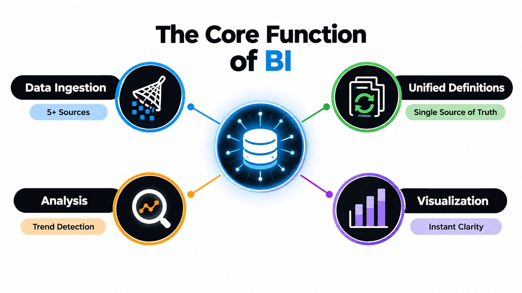
A dashboard earns its place when it changes the weekly conversation. It should show which void needs escalation, which contractor needs a call and whether arrears activity is moving in the right direction.
It isn't a replacement for Reapit, Alto, Fixflo, Arthur or Qube. It isn't automatically a data warehouse project, and it isn't useful merely because it refreshes frequently. A screen that nobody trusts or reviews is just another report.
KPIs That Change Weekly Decisions
A weekly dashboard should be built around decisions, not around every field available in the database. The right KPI has an owner, a source and a clear action when it moves outside the agreed range.
For a letting operation, rent arrears as a percentage of monthly debit is more useful than total arrears alone. It shows the size of the problem against the rent expected and helps the owner decide whether the next action is a standard chase, a manager review or a structured escalation. The data normally comes from the property management or accounts platform.
Average days void belongs on the screen because it connects empty stock to lost management-fee opportunity. It can trigger an instruction to review pricing, photography, viewing availability or maintenance completion. Without a consistent start and end date, though, the number is decorative.
Maintenance tickets opened versus closed by priority shows whether the team is reducing the queue or receiving work faster than it can finish it. Contractor SLA breach rate adds accountability by identifying suppliers who need a conversation, a revised scope or a change in allocation.
For block management, certificate renewals and deposit protection compliance need careful treatment. The dashboard can flag records approaching an internal review date or missing evidence, but a named person must verify the record before anyone contacts a tenant, landlord or regulator. A solicitor or compliance adviser should confirm how the relevant requirement applies in England or Wales.
Serviced accommodation needs different measures. Occupancy by channel can show whether the mix of direct bookings, online travel agencies and other channels is working as intended. Average length of stay helps inform pricing, cleaning capacity and turnaround planning.
| KPI | Decision It Informs | Source System |
|---|---|---|
| Rent arrears as a percentage of monthly debit | Which accounts need review and escalation | Accounts or property management platform |
| Average days void | Whether to change pricing, marketing or turnaround ownership | Reapit, Alto or property management platform |
| Tickets opened versus closed by priority | Whether maintenance capacity matches incoming work | Fixflo or maintenance platform |
| Contractor SLA breach rate | Which contractor relationships need intervention | Fixflo, contractor records or workflow system |
| Certificate renewal status | Which records require human verification | Compliance register or property platform |
| Occupancy by channel | Where booking and allocation attention should go | Channel manager |
| Average length of stay | How to plan pricing, cleaning and turnaround | Booking platform or channel manager |
These dashboard examples for property operations show why the first version should stay close to recurring decisions.
Total units managed and total revenue can be useful context, but they rarely change a weekly operational decision on their own. They're better as headline context than as the main content of the screen.
How a Dashboard Connects to What You Already Run
The dashboard sits above the operating platforms. It doesn't replace them.
A typical build starts with read-only extracts or API calls from Reapit, Alto, Fixflo, Arthur, Qube and related systems. The data then moves into a reporting store such as BigQuery, PostgreSQL or a managed equivalent, where it can be cleaned and joined before reaching the visualisation layer.
The wiring matters more than the chart library. Fixflo job statuses may represent several internal states. Reapit addresses may be formatted differently across users. Qube general-ledger postings may appear after the operational event that caused them.
A builder has to choose an integration pattern:
- Live API loading: Useful where a decision depends on current status, but it can put pressure on source systems and make failures harder to audit.
- Scheduled ETL: Data is extracted, cleaned and loaded at an agreed cadence. For many UK property SMEs, this is the sensible trade-off because it's easier to monitor and separate from source-system performance.
- Event streaming: Appropriate where events need to flow quickly between systems, but it adds engineering and monitoring work that a weekly operational dashboard may not justify.
The first build should make the refresh time visible. It should also record failed loads, missing fields and rejected records rather than just displaying partial figures.
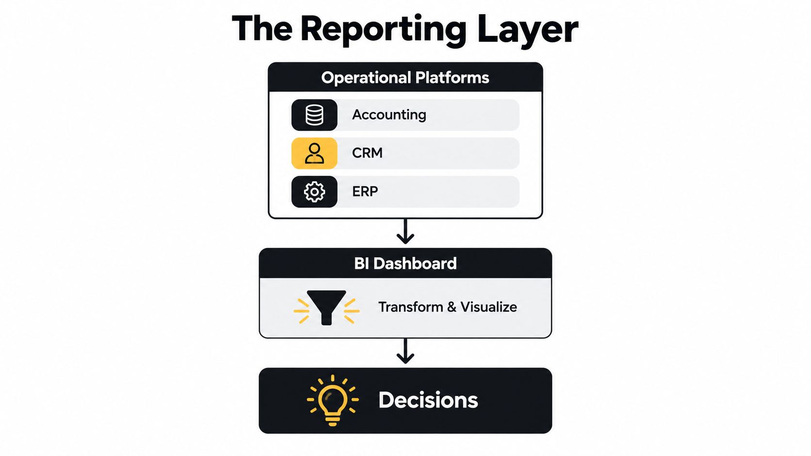
Understanding API integration in operational systems matters because a connection isn't the same as a trustworthy reporting process. Someone still needs to decide which field is authoritative and what happens when two systems disagree.
Human approval points are essential:
- Schema changes: A named owner checks any new or changed source field before it affects a KPI.
- Privacy exclusions: Tenant redactions, right-to-rent exclusions and access permissions need approval from the appropriate owner.
- KPI definitions: The person accountable for the measure approves its formula and source.
- Outbound messages: Any email to a tenant, landlord, contractor or regulator requires human review before sending.
- Compliance flags: The dashboard can surface missing or ageing records, but it must not make a legal decision.
The output should be a screen a director can open at 8am and understand without asking someone to explain which spreadsheet was used.
What Dashboards Do Not Fix
A dashboard is a lens, not a cure. It won't repair duplicate landlord records, make staff close maintenance jobs, or correct service charge invoices posted late.
It also won't create ownership where none exists. If nobody is responsible for reviewing the void list, the list can be accurate and still have no operational effect. If nobody closes a Fixflo job, the maintenance backlog will remain misleading however well it's displayed.
The largest failure point is often the data layer. The UK Business Data Survey found that at least 79% of businesses described their data as sufficient, consistent, accessible, documented, usable, secure and timely, but only 26% said it was interoperable across systems. The official UK Business Data Survey evidence points to the joining of systems as the practical bottleneck.
That problem appears in everyday property operations:
- A tenant identifier differs between the CRM and accounts platform.
- The property list in Reapit doesn't match the spreadsheet used by the block team.
- Void dates are manually tallied on a manager's monitor.
- A repair is marked complete in one system but remains open in another.
The honest order is fix the data, then build the dashboard. The Welsh health intelligence review used gold, silver and bronze data-quality grading and identified data quality and timeliness as key risks. The Welsh review of business intelligence illustrates why refresh cadence alone isn't enough. Quality status and source freshness should sit beside the KPI.
A polished screen that senior staff don't trust is worse than no dashboard. It consumes the team's patience, then sends decisions back to gut feel.
Workflow automation for property operations can address the action after a KPI is trusted, but automation shouldn't hide a weak source process.
Why Hiring, Switching Platform or ChatGPT Is Not the Answer
Doing nothing is a valid choice when the problem doesn't affect cash, service quality, compliance administration or capacity. If the owner can't name a recurring decision that better visibility would improve, a dashboard is probably not the right first project.
Hiring another analyst or operations manager may help, but it adds another person to a process that still depends on inconsistent records. A new hire can prepare a better spreadsheet, yet the business remains dependent on manual collection and personal knowledge.
Switching from Reapit, Alto, Arthur or Qube can look attractive when the current views frustrate the team. A platform change is still a major operational project, and it won't automatically remove duplicate records, inconsistent statuses or weak ownership. You may end up with a newer interface showing the same uncertainty.
ChatGPT can help someone inspect a supplied CSV or draft a summary. It isn't a controlled reporting layer when it has no approved live connection, no reliable audit trail and no guarantee that the same question will produce the same number after the underlying file changes.
| Option | Cost | Time to Value | Repeatability |
|---|---|---|---|
| Do nothing | Existing staff time and unresolved visibility gaps | Immediate, but no new visibility | Low |
| Hire another person | Salary, recruitment and management overhead | Depends on recruitment and data familiarity | Depends on the person |
| Switch platform | Migration, training and process disruption | Delayed by implementation | Potentially consistent, but data quality still needs work |
| Use ChatGPT on exports | Low software cost, with preparation and checking time | Quick for one-off questions | Low without governed inputs |
| Build a reporting layer | Integration, data cleaning and ownership work | Gradual, starting with a focused KPI set | High when definitions and refreshes are controlled |
The useful product isn't the chart. It's the repeatable answer to the same question, at the same point in the week, with a named person responsible for acting on it.
What to Look At First in Your Own Operation
Start with the data layer, not the screen layout. Pull a raw export covering the last 90 days from the primary platform and check whether the same fields mean the same thing across users, branches and property types.
Use four candidate measures for the initial review:
- Void turnaround: Can you identify the start and end dates without manual correction?
- Rent collection cycle: Can the accounts figure reconcile to the source ledger?
- Maintenance closure: Do priority and completion statuses reflect what the team considers finished?
- Booking conversion: Can enquiries, bookings and cancellations be matched across the channel manager?
Don't commit to a dashboard until each number reconciles to a source of truth. The UK Government's business data study found that around 83% of UK businesses handle some form of digital data, 72% analyse it, and only 4% engage with big data, according to the Business data use and productivity study. The practical lesson is that most businesses don't need a grand analytics programme first. They need a clean bridge between the records they already hold and the decisions they already make.
Write a one-page brief naming the KPI owner, source, refresh cadence and weekly decision. If you can't name one owner, or the number doesn't change a specific decision, leave it out of version one.
A dashboard can then become a behaviour-change project. The team sees the same position, managers review exceptions, and the owner can decide whether another hundred doors require better process or another salary. It still won't replace judgement, and a solicitor or compliance adviser should confirm any legal or regulatory interpretation.
The AI readiness scorecard is a practical tool for checking whether the data and ownership needed for this kind of project are in place.
InnovaAI Integration Ltd builds custom dashboards and connected systems around the platforms property teams already run, including the data checks, approval points and operational views that make a business intelligence dashboard usable. Visit InnovaAI Integration Ltd for a free discovery call to work out whether it's even a fit, and if it isn't, I'll say so on the call.